Public
Defining the identity of a community-first investing platform
The stock market has historically been an intimidating and complicated place. Although digital tools for investing have become simpler and more user-friendly, the culture of the stock market can still feel like an exclusive club. Especially for new investors.
Public is a new fin-tech start-up looking to change the status quo by inviting younger, more diverse, and non-traditional voices into the investing conversation. By changing the culture of the stock market, they have already helped over a million people feel more comfortable investing and take a more active role in building their financial future.
Our challenge was to reimagine Public’s existing brand identity in order to create something unique and expressive that highlighted the humanity of the brand.
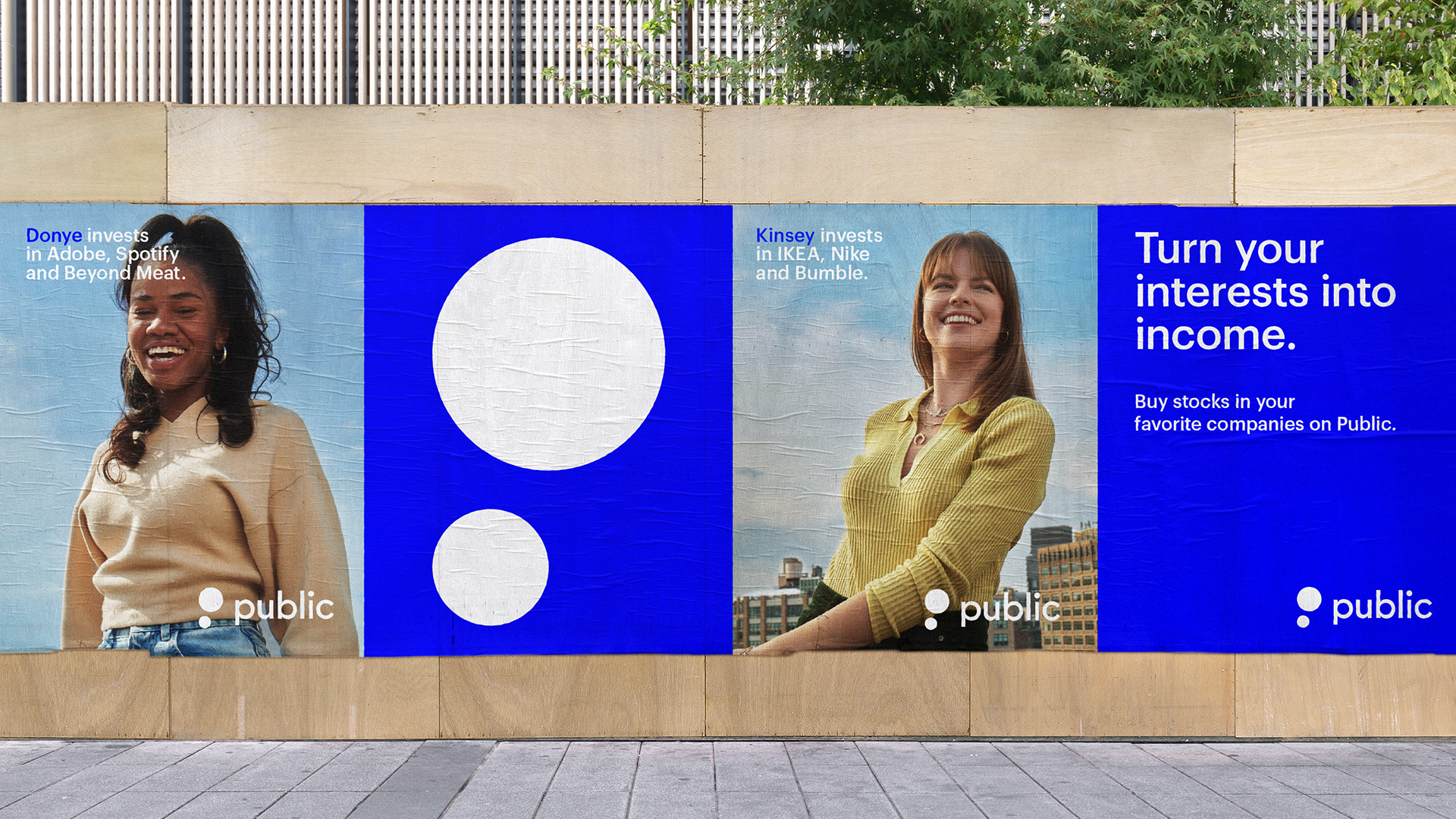
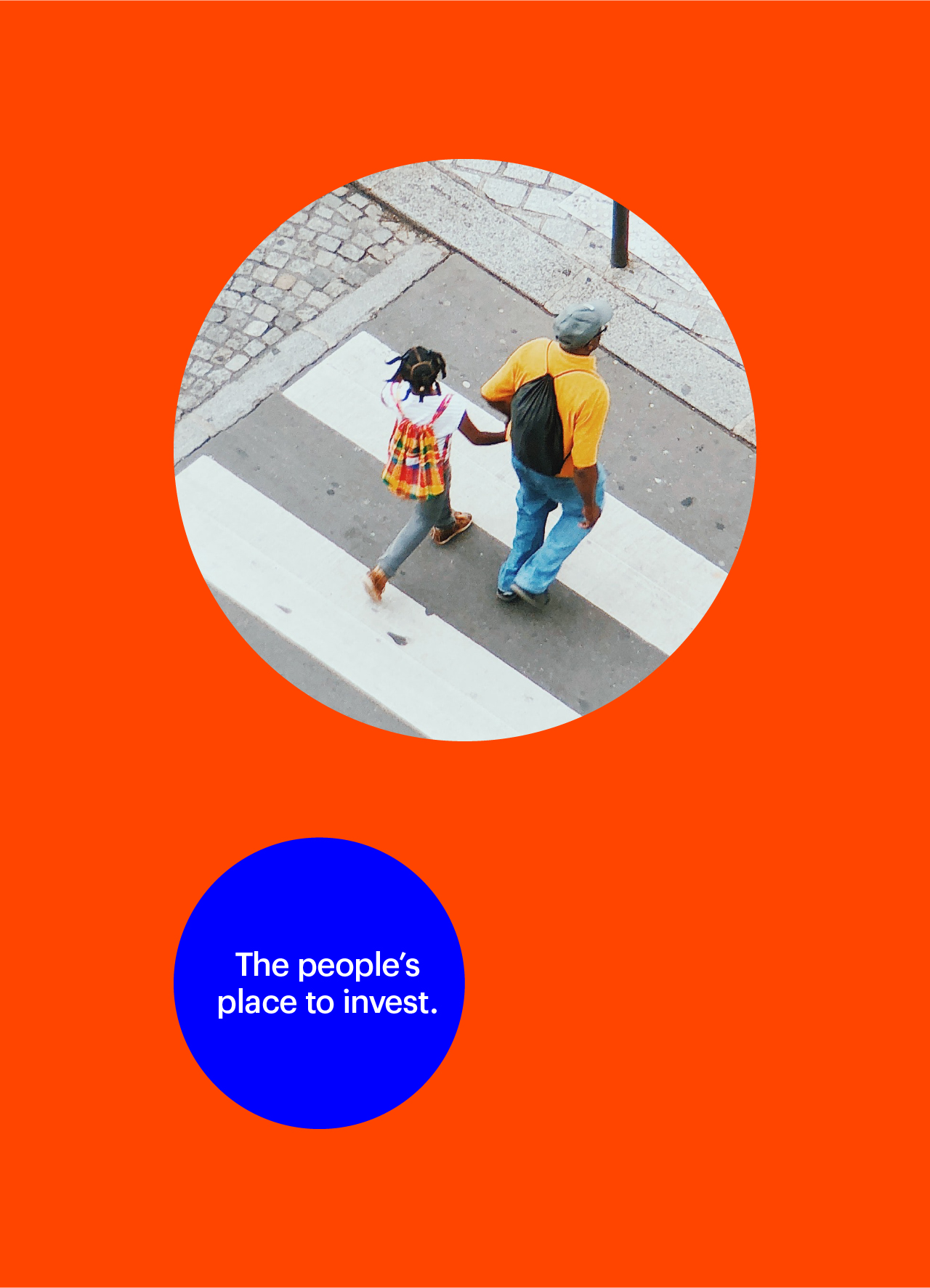
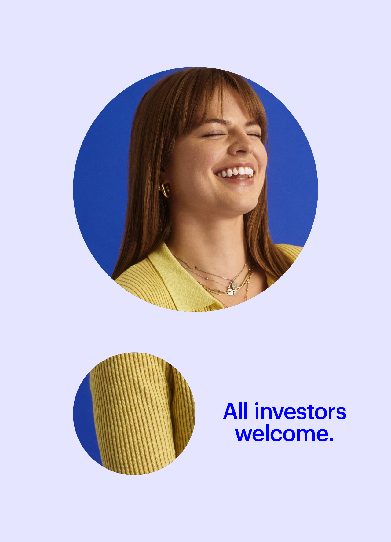
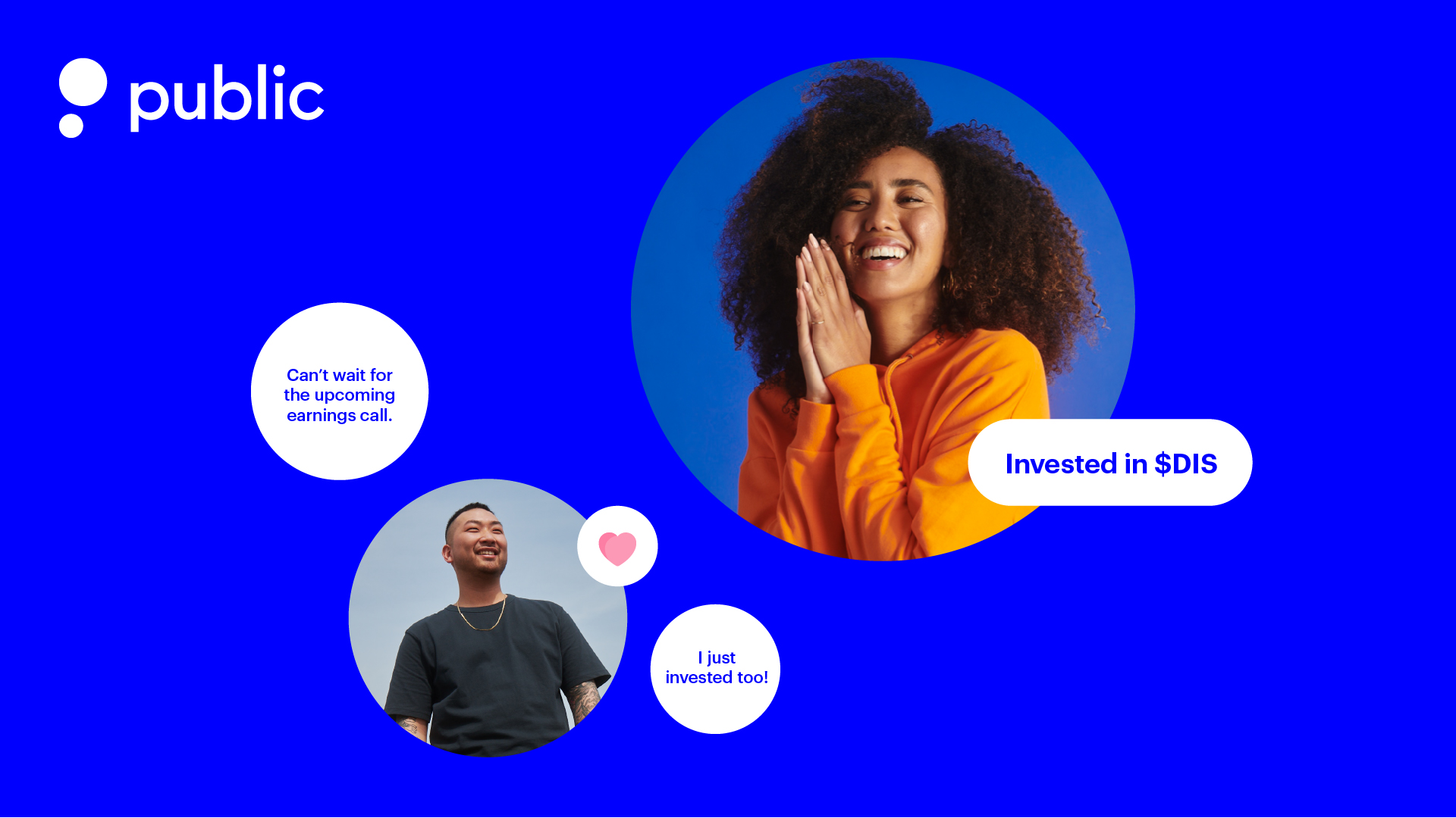
Inspired by the diversity of voices and collaborative culture, we built Public’s identity to represent an exchange of ideas and a platform for growth.
Start Small and Grow
The new logo mark tells the story of small beginnings and long-term growth. As an investor, your portfolio will grow over time and so will your confidence as you become more experienced. The dots are a symbol of momentum and progress.
Community Grows through Conversation
The two circles nod to Public’s community and social features. As two dots, they come together to represent chat bubbles and the conversations taking place on the platform.
P is for Public
The icon stacked and left-justified becomes an abstract form representing the capital letter P. As a mark, it creates a simple, warm, and friendly personality for the brand.
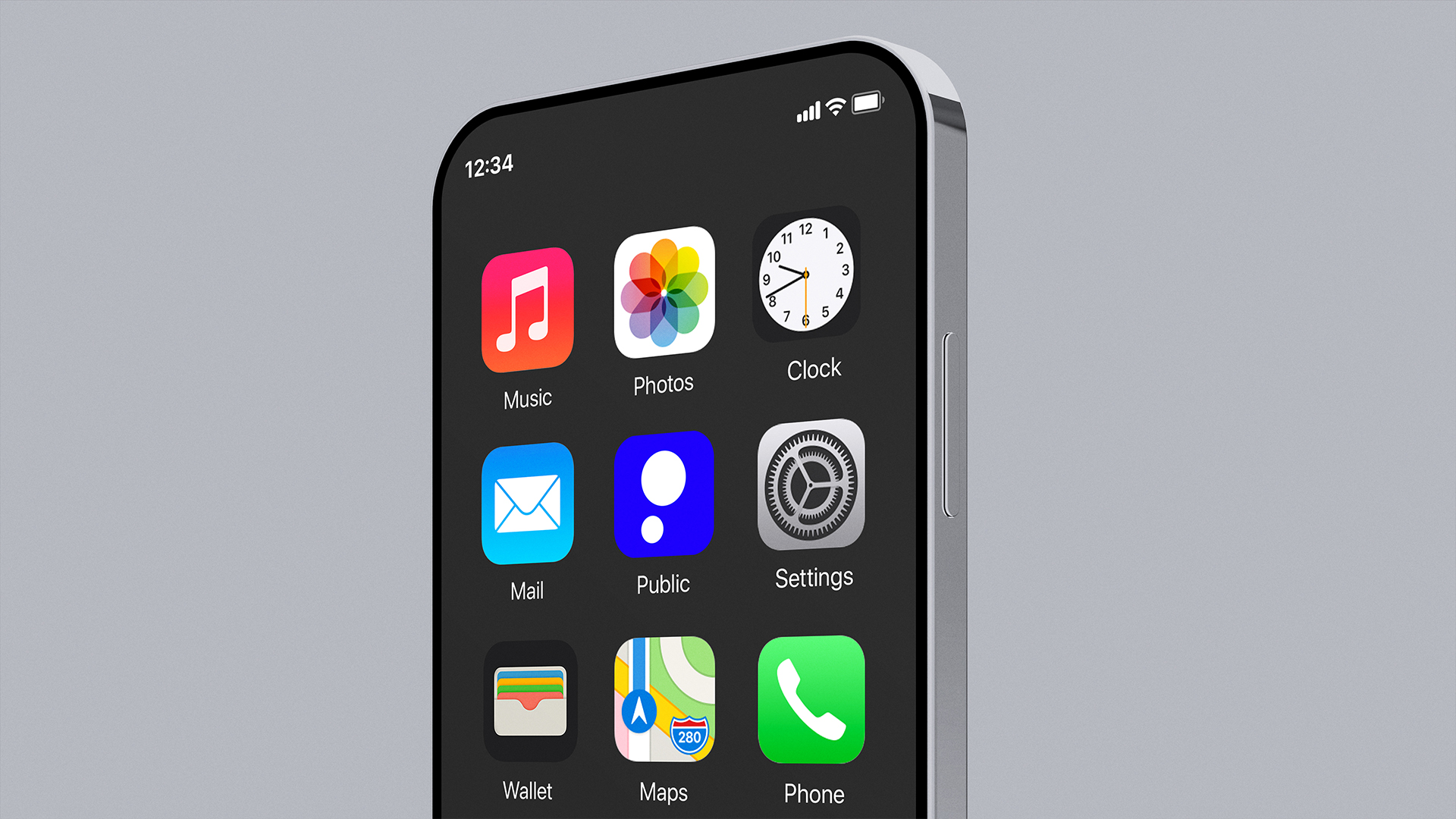
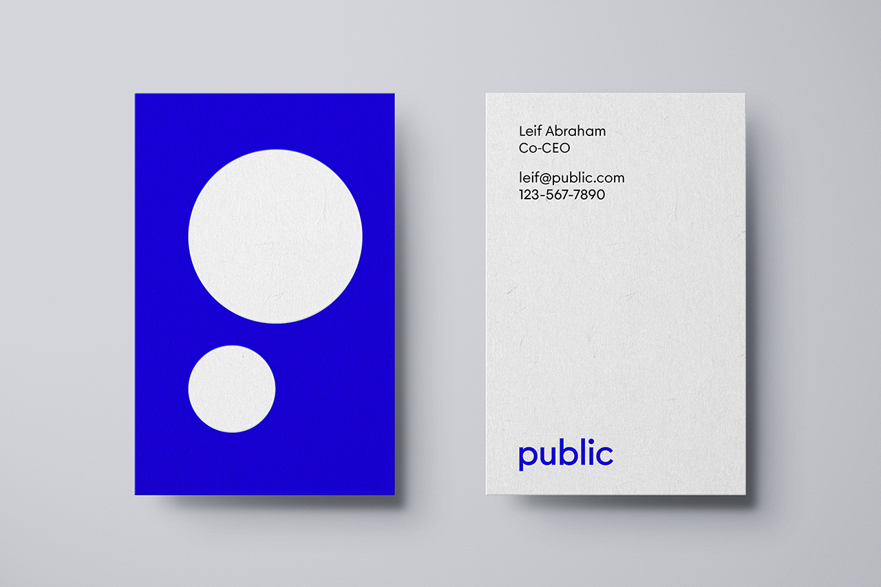
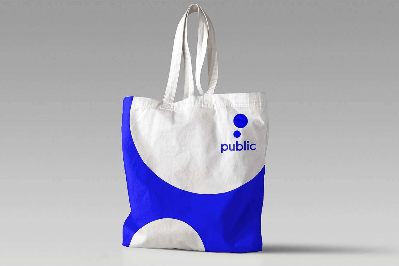
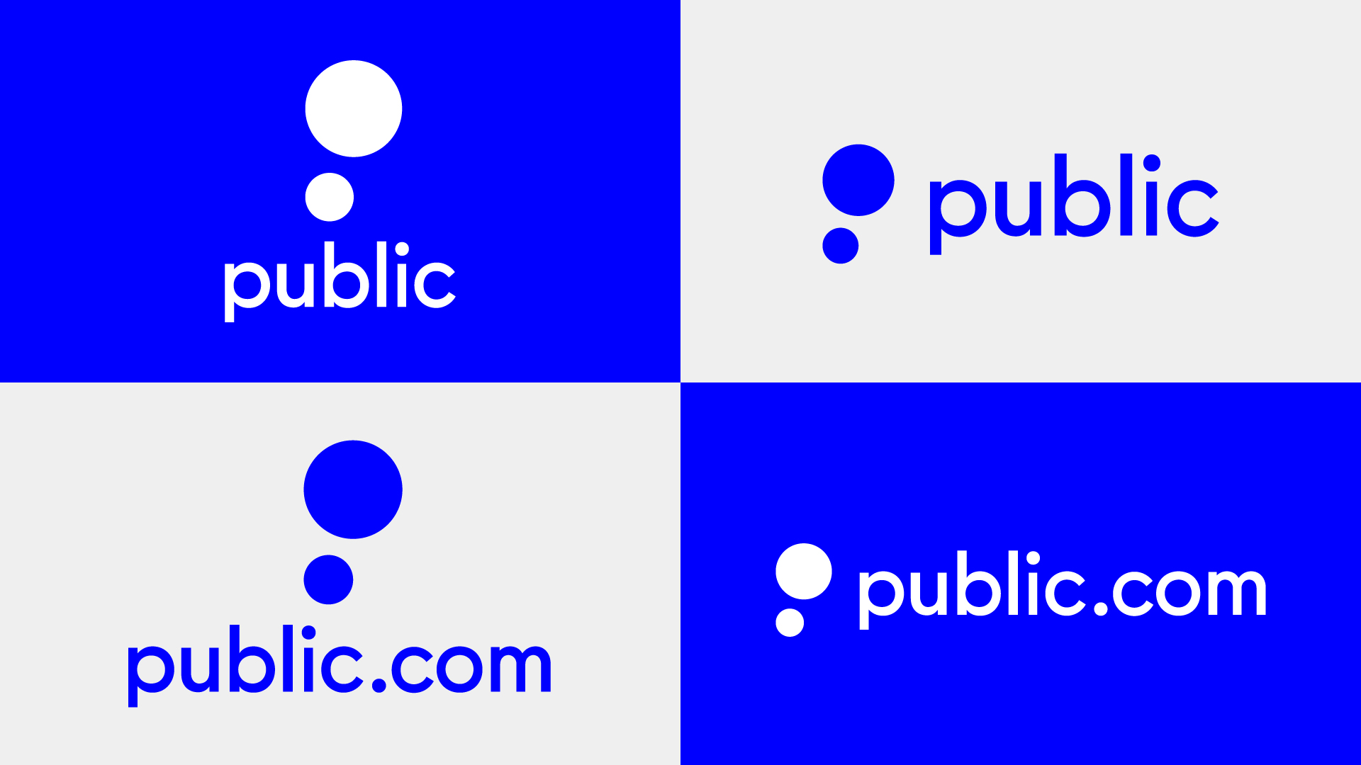
The Public wordmark is a custom drawn geometric san serif based on Big Dot Sans by And Repeat Type Foundry. The rounded letterforms and open counters mimic the circles in the icon, and feel approachable and optimistic. The wordmark is balanced with 3 circles at the beginning, middle, and end.


Team and Collaborators
Strategy
Gabrielle Muse
Greg Donnelley
Design
Martin Grasser
Federico Parra Barrios
Zrinka Buljubašić
Lilly Archer
Fer Cozzi
James Heredia - Motion Design
Operations
Maya Shetty
Public
Defining the identity of a community-first investing platform
The stock market has historically been an intimidating and complicated place. Although digital tools for investing have become simpler and more user-friendly, the culture of the stock market can still feel like an exclusive club. Especially for new investors.
Public is a new fin-tech start-up looking to change the status quo by inviting younger, more diverse, and non-traditional voices into the investing conversation. By changing the culture of the stock market, they have already helped over a million people feel more comfortable investing and take a more active role in building their financial future.
Our challenge was to reimagine Public’s existing brand identity in order to create something unique and expressive that highlighted the humanity of the brand.
Start Small and Grow
The new logo mark tells the story of small beginnings and long-term growth. As an investor, your portfolio will grow over time and so will your confidence as you become more experienced. The dots are a symbol of momentum and progress.
Community Grows through Conversation
The two circles nod to Public’s community and social features. As two dots, they come together to represent chat bubbles and the conversations taking place on the platform.
P is for Public
The icon stacked and left-justified becomes an abstract form representing the capital letter P. As a mark, it creates a simple, warm, and friendly personality for the brand.


The Public wordmark is a custom drawn geometric san serif based on Big Dot Sans by And Repeat Type Foundry. The rounded letterforms and open counters mimic the circles in the icon, and feel approachable and optimistic. The wordmark is balanced with 3 circles at the beginning, middle, and end.


Team and Collaborators
Strategy
Gabrielle Muse
Greg Donnelley
Design
Martin Grasser
Federico Parra Barrios
Zrinka Buljubašić
Lilly Archer
Fer Cozzi
James Heredia - Motion Design
Operations
Maya Shetty
Contact
We’re always on the lookout for
interesting projects with interesting people.
Say hello at mgrasser@gmail.com
© 2024 Martin Grasser. All rights reserved.